Buttons
Buttons appear on a lot of websites with a number of variations for different actions, ranging from submit form button, and cancel/delete button to branded and secondary buttons.
To give users the best experience and a good design hierarchy, different actions should vary in design and be easily identifiable to the user. Take this case of a form submission the right button in green is a publish button while the one on the left is a cancel button.
To a user button placement like this gives them a hint about which button does what, in other cases, different styled buttons tell them which one is more important providing a hierarchy for users.
This can lead to writing a lot of CSS to create the different variants and often cause CSS specificity issues or overriding styles when newly designed buttons are added. This is where CSS variables can help.
What are CSS Variables
CSS variables are custom properties that can be set on a document or an element like a button. Like variables in other languages, this allows us to reference an instance in multiple places as well as change it.
In the below code, we are setting the default variable, using it in any element with the class `element` will have the background colour red, unless it has the class purple which overrides the root/default variable.
/* Global / default settings */
:root {
  --bg-color: red;
}

/* This is how CSS variables are called */
.element {
  background: var(--bg-color)
}

/* This is how you override the variable for elements with a different class */
.purple {
  --bg-color: purple;
}
How can CSS Variables be used for buttons?
Buttons will often have very similar styles with variants that have different background colours, border colours and text colours etc, by making CSS variables for each of these we can easily change them in classes without causing CSS specificity issues.
Take the below code, any element with the class button will use the default colours unless it has any of the other classes which change the colours.
:root {
  --btn-border: gray;
  --btn-background: white;
  --btn-color: black;
}

.warning {
  --btn-border: red;
  --btn-background: red;
  --btn-color: white;
}

.success {
  --btn-border: rgb(6, 104, 6);
  --btn-background: green;
  --btn-color: white;
}

.brand {
  --btn-border: blue;
  --btn-background: blue;
  --btn-color: white;
}

.button {
  border-color: var(--btn-border);
  background: var(--btn-background);
  color: var(--btn-color);
  /*  Add other button styles here or utility/tailwind classes on the element */

  &:hover {
    opacity: 0.9;
  }
}
This allows us to make buttons with a lot less CSS when creating buttons compared to older methods.
Where else can they be used?
You can expand on the way they have been used for buttons to create elements such as an alert box which can include error, success or branded messages.
They can be used for a mix of things such as CSS animations, to allow you to change animation delay, duration, and the item's original transform property. To create light and dark themes of sites and even have a shared variable that can be changed on an event via JS, recalculate a value based on the browser size.
The Future of CSS Variables using Container Queries.
Container Queries are an exciting feature that is coming to modern browsers which have launched with container sizes, in the future (chrome 111) will add style queries allowing us to change styles based on an element's style properties including CSS variables.
@container containerName style(--featured: true) {
  .article {
    /* Add Featured article styles here */
  }
}
Browser Support
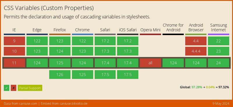
Current browser support for CSS Variables:
